
I’ve spent the past week mulling over the concept of data visualization — honing in more on the first word, data. What exactly is data, anyway? What do we consider to be data in the context of digital scholarship? I don’t want to go deeply into the rabbit hole here, but as I’ve delved more into the world of digital scholarship, it’s become evident that so much of what we do is based on some form of data — be that numerical data, textual data, geospatial data, audiovisual data, etc. So even though this week was data visualization week, data viz is actually a common theme throughout our program. Last week we experimented with Voyant as a means of visualizing textual data, and in Week 4 we’ll be looking at timelines, maps, and networks — all of which require data in one form or another. Data really is everywhere in digital scholarship! And with that, here’s how Week 3 unfolded.
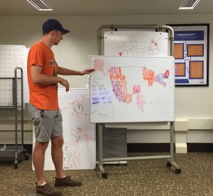
On Monday, Jill Hallam-Miller and Ben Hoover joined us for a session on data literacy. Before we took a deep dive into learning how to make our own data visualizations, it was important to think about what makes a visualization good, bad, or somewhere in between. We drew our on visualizations based off a dataset of first year students’ hometowns, deconstructed a number of visualizations, came up with our own criteria for evaluating visualizations, and talked about data cleaning. I’m confident that our students will be looking at any data visualizations they encounter in the future with a critical eye!
On Tuesday, we were joined by our colleague Ken Flerlage, for the first of a two-part workshop on Tableau. Among the many data visualization tools currently available, Tableau sits at the juncture of tools that are robust in terms of what they can do both presentation wise and analysis wise. Although there are a lot of intricacies in figuring out exactly how to visualize a dataset, the underlying premise of Tableau is that you create a worksheet for each graph, and then put them all together into a dashboard, which can be stylized with text and images. Our students picked up the process pretty quickly, and Thursday we tested our newfound skills by working with a dataset from the #MakeoverMonday project. Each week, the facilitators of #MakeoverMonday post a link to a chart and its data, and invite anyone to redesign the chart. This week’s dataset was from the Tate Collection; you can check out our students’ vizzes here: Minglu; Rennie; Justin.
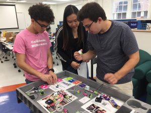
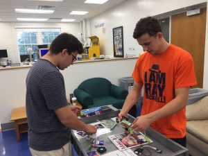
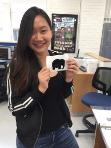
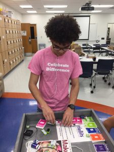
We ended our week with a bit of fun and took a walk over to the College of Engineering to visit the Maker-E, Bucknell’s electronics maker space. The space has a lot of tools for designing and working with electronics components, 3D printers, a vinyl sticker cutter, and more. We spent most of our time playing with the littleBits, which are sort of like electronic Legos. There are LED lights, speakers, a mini keyboard, and many other parts that you can connect together to make little gadgets. Tyler even figured out how to connect his phone to the littleBits speakers so he could play music (and the tiny speakers sounded pretty good!).
It’s hard to believe we’re already heading into Week 4 of the program, aka the halfway point. The students are deep into their research and continue to make great progress! We’ve got another full week lined up, including a trip to Bryn Mawr College to meet up with other students who are in programs similar to ours.